ECOMMERCE BUSINESS SERIES: PART ONE / 5 STYLES OF A FEATURE ESTORE PHOTO
You're a product business. You've gone through a lengthy (seemingly endless) samples process. You've manufactured your product. You've received your stock - and now you're ready to prepare for launch. The product page on your website is the final step before moving your customer from consideration to purchase, so it's one of the most important pages to get right. If a customer has travelled that far into their journey with your brand and ended up on your website looking to buy a product, you want to ensure you're doing everything possible to capture that customer and encourage them to hit that magic "add to cart" button. And that's exactly what this 3 part blog series is designed to help you achieve - from the styles of estore photos, to the different types of photos to feature and some other handy tips you didn't even know you needed to know.
For now, we start with the different styles you could consider as the feature image for your product page, that appears on the main shop page.
DEEP ETCHED
The background is removed in post editing leaving a true white infinite background that blends seamlessly with a white computer screen. This requires more time in the editing process as the product needs to be cut out, the more shapely the product is or the more items in the shot, the longer this will take. This style creates a really clean, seamless look to the page overall and makes it super easy to spot the product you're looking for.


SOLID BRAND COLOUR
Your brand hex colour digitally applied as the background in post editing.

INFINITE BACKGROUND
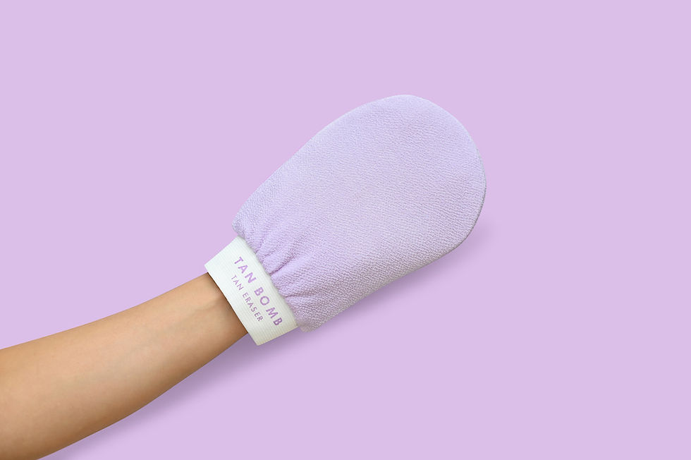
Your product is shot on a coloured or textured backdrop set up with a curve to create a seamless background. This style will get some small variations in shadow and light. Or shooting against a textured backdrop like linen or a muslim wrap will give a bit more depth to the shot.

REFLECTION
For those wanting a little more flavour in the hero shot, this option has your product set up on a white base that creates a subtle reflection effect. The backdrop could be white or coloured or post edited to match a brand colour. I'd recommend this style if you only have a few products on your shop page. It can become a little busy if you have a heap of products listed on the main shop or category page.

SUNLIGHT SHADOWS
A soft line where the background and the base meet, shot in natural light to create shadows. Another option that is a bit more striking, perfect for boxed packaging and simple products. But as this style relies on direct sunlight, it can be harder to get consistency across a large range of products (as the sunlight will dull and brighten depending on the day) I wouldn't recommend this style if you are on a tight timeline, as the weather impacts the ability to shoot. As a product photographer on the Gold Coast I am pretty fortunate with sunny days, but this isn't always the case.

The style really comes down to the type of products you have and your brands vibe. And there are certainly more than just these options, but I've found these to be the most popular styles requested for estore product photography. Feel free to get in touch with me if you have any questions about any of the styles.
Stay tuned for the next blog in this ecommerce biz series, where I'll be sharing the important things your estore photos must have to set you up for success.


Comments